fbpx

What Is a Pop Up Form: 5 Strategies for Email List Building in 2025

What Is a Pop Up Form: 5 Strategies for Email List Building in 2025.
Ever landed on a website, started browsing, and suddenly, a little window pops up asking for your email? 
 
That’s a pop-up form. It’s one of those things you can’t ignore, and whether you love them or hate them, they’re here to stay. But here’s the real question: 
 
Are they still useful in 2025, or are they just digital clutter? 
 
Let’s chat about what pop-up forms are, why they matter, and how to use them in a way that actually works.


So, What Is a Pop Up Form Anyway?
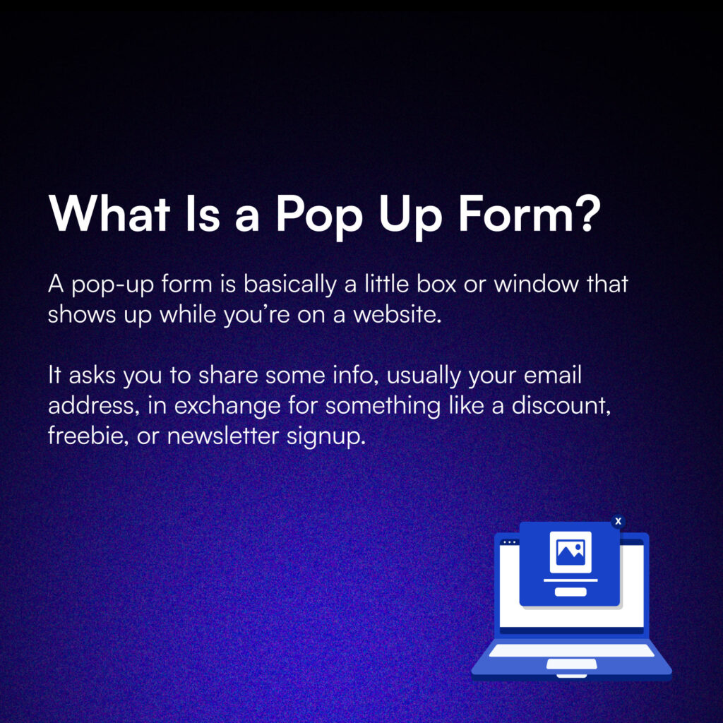
So, What Is a Pop Up Form Anyway?
Think of it as a trade—you give your email, and they give you something valuable (hopefully). 
 
They can pop up in different ways—sometimes right in the middle of your screen, sometimes sliding in from the side, or even taking over the whole page. They’ve been around for years, but in 2025, they’ve become smarter, less annoying, and way more effective.
 

Why Are Pop Up Forms Big Deal?

Here’s the thing: your email list is gold. If you’re running a business, it’s one of the best ways to connect with your audience, promote your product or services, and build relationships. 
 
But building that list? It takes work. That’s where pop-up forms come in.
 
Pop-ups grab attention. They’re designed to say, “Hey, don’t leave without checking this out!” And when they’re done right, they can turn a casual browser into a loyal subscriber. The trick is to make them feel helpful, not pushy.
 

What’s Changed About Pop-Ups in 2025?

Pop-ups have come a long way from the days of being outright annoying. These days, they’re way more sophisticated. 

For starters, they’re smarter about when and where they appear. Instead of randomly interrupting, they’re triggered by your behavior—like scrolling to the bottom of a page or hovering near the exit button.
 
They’re also more visually appealing. No more clunky designs or walls of text. Today’s pop-ups are clean, simple, and straight to the point. Oh, and they work great on mobile, which is a must since everyone’s glued to their phones.


Types of Pop-Ups You’ll See

Not all pop-ups are the same, and that’s a good thing. Each type has a unique purpose, and when used right, they can help you connect with your audience and even boost your sales. 
 
Let’s break them down with some real-world examples from e-commerce brands that are crushing it with their pop-ups.
 

1. Exit-Intent Pop-Ups

These are like a digital Hail Mary. They detect when you’re about to leave a website—like when your mouse drifts toward the “X” to close the tab. That’s when they jump in with a message that says, “Wait! Don’t go just yet!”
 
Real-Life Example:
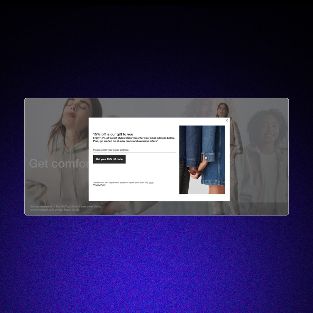
Imagine you’re browsing Gap’s website, checking out some cozy sweaters, but you hesitate to finalize your purchase. Just as you’re about to close the tab, a pop-up appears: “15% off is our gift to you! Enjoy 15% off select styles..” Tempting, isn’t it?
 
Exit-Intent Pop-Ups example from Gap.
Why They Work:
Exit-intent pop-ups target visitors right as they’re about to leave. Whether it’s offering a discount or highlighting free shipping, they grab attention at the perfect moment. 
 
Bonus: Using exit pop ups can help your business recover 10–15% of potential lost sales.
 
Pro Tip:
Make the offer irresistible. Discounts, free shipping, or even a small gift can keep customers from walking away.
 

2. Timed Pop-Ups

These pop-ups take a more subtle approach. Instead of showing up the moment you land on a site, they wait until you’ve been browsing for a bit. It’s like they’re saying, “You’re enjoying yourself—now let me sweeten the deal.”
Real-Life Example:
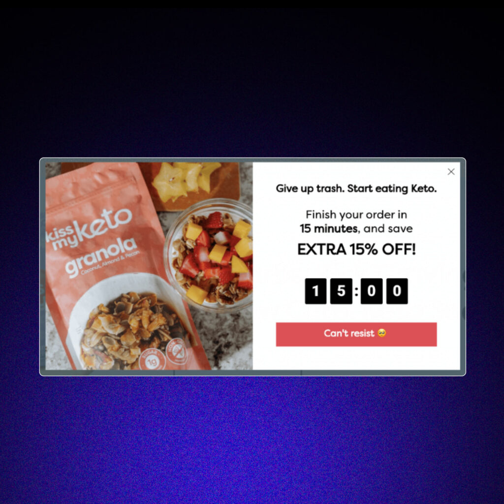
Imagine you’re browsing Kiss My Keto, checking out their low-carb snacks and supplements. After adding a few products to your cart and debating your purchase, a pop-up appears: “Finish your order in 15 minutes and save extra 15% OFF!” By then, you’ve already explored the site, and the offer feels like the perfect incentive to take action.
 
Why They Work:
Because they don’t interrupt your experience right away, timed pop-ups feel less pushy. They’re great for engaging shoppers who are genuinely interested but might need a little extra motivation to complete their purchase.
 
Timed Pop-Ups example from Kiss My Keto.

3. Scroll-Triggered Pop-Ups

These pop-ups are all about timing. Instead of popping up randomly, they appear after you’ve scrolled a certain percentage down the page. Why? Because scrolling shows you’re interested in the content—and that’s the perfect moment to offer something valuable.
 
Real-Life Example:
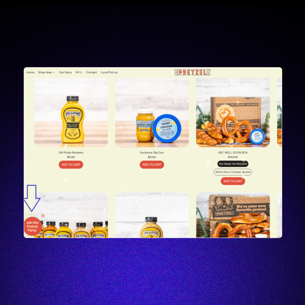
Picture this: you’re exploring The Pretzel Company’s website, scrolling through their story, and drooling over their handmade pretzel flavors. As you get deeper into the page, a pop-up appears: “Love pretzels? Join The Pretzel Club! Sign up now for exclusive deals, recipes, and behind-the-scenes news.” It feels natural, perfectly timed, and tailored to your browsing experience.
 
Why They Work:
Scroll-triggered pop-ups don’t feel intrusive because they appear when people are already engaged. By offering something relevant—like discounts, recipes, or exclusive updates—they turn casual visitors into loyal fans. And because they’re based on user behavior, they’re much more likely to convert.
 
Pro Tip:
Tie the pop-up offer to what the visitor is browsing. For example, highlight special deals on the product they’re exploring or offer exclusive content tied to the page they’re on.
 
Scroll-Triggered Pop-Ups from the Pretzel's Company.

4. Welcome Pop-Ups

These are the ones that greet you as soon as you land on a website. Think of them as the digital equivalent of a friendly store clerk saying, “Hey! Can I help you find something today?”
 
Real-Life Example:
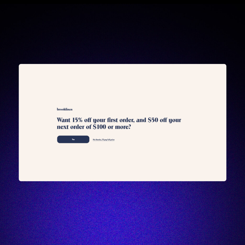
When you visit Brooklinen, you might see a pop-up right away: “Want 15% off your first, and $50 off your next order of $100 or more?” 
 
It’s a warm welcome, and who doesn’t love a discount?
 
Welcome Pop-Ups examples from Brooklinen.
Why They Work:
What is a pop up form without welcome pop-ups, right? They are upfront and direct, which makes them super effective for grabbing attention right away. They’re especially powerful for first-time visitors who might need a little extra encouragement to stick around.
 
Pro Tip: Keep it simple and visually appealing. A clean design with a clear call-to-action works best here.
 

5. Hyper-targeted Pop Up Forms

Pop-ups work best when they’re simple, helpful, and timed just right. Using a mix of targeting strategies—like combining time delay, scroll delay, and page targeting—makes them hyper-relevant based on user actions and specific landing pages.
 
Real-Life Example:
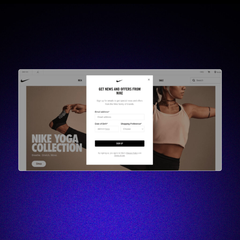
Imagine landing on a Nike page for running shoes. After 8 seconds and scrolling 50% down the page, a pop-up appears featuring a sleek image of someone running effortlessly in Nike shoes. The form invites you to “Sign up for news and offers from Nike!” It’s targeted, visually relevant, and feels like a natural extension of your browsing experience.
 
Why They Work:
These pop-ups create personalized moments that engage users at just the right time. Whether it’s discounts, VIP perks, or exclusive updates, they give visitors a reason to stay and connect. Plus, the targeting ensures they’re seeing messages tailored to their interests—a win-win for both engagement and conversions.
 
Hyper-targeted Pop Up Form example from Nike.

What is a Pop Up Form: The 11 Agency Way
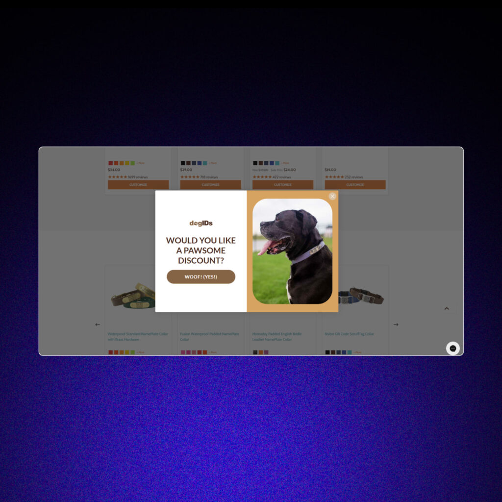
Here are some of the best pop up form examples from 11.
 
1. Pop up form example from the dogIDs:
 
Pop up form example from the dogIDs.

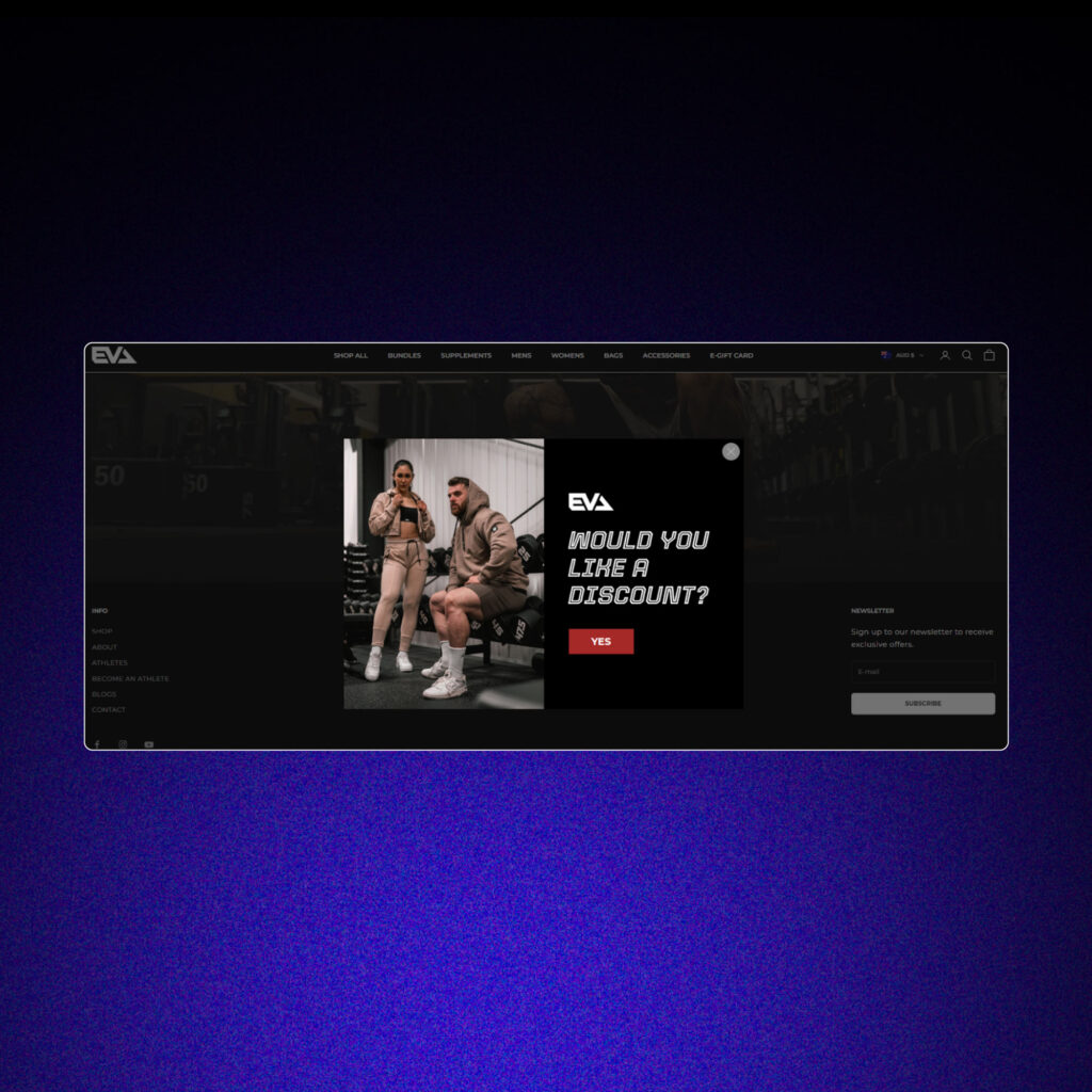
2. Pop up form example from EVA:

Pop up form example from EVA.

3. Pop up form example from The Goodfor Company:
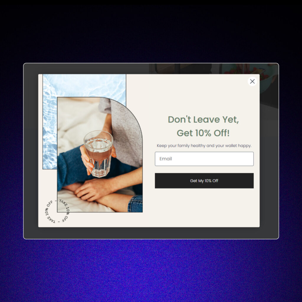
Pop up form example from The Goodfor Company.

How to Make Pop-Ups Work (Without Annoying People)

Pop-ups can be powerful, but only if you use them the right way. Nobody wants to feel bombarded with pop-ups every five seconds. Here are some tips to keep your visitors happy while still building your email list:

1. Give People a Reason to Sign Up

Nobody’s going to hand over their email for no reason. You need to offer something valuable. Discounts, free guides, exclusive content—these are the things that get people to click “subscribe.” A great website pop-up newsletter example could be something like, “Join our list for 10% off your first order!” Simple, clear, and enticing.

2. Don’t Be Pushy

Pop-ups should be easy to close or dismiss. Adding a visible “X” or a polite “No thanks” button gives users a sense of control. This approach ensures they don’t feel trapped or frustrated, which can improve their overall experience on your site.

3.  Test Different Approaches

Try different designs, messages, and timing for your pop-ups. Maybe a bold, colorful design works better for your audience. Or perhaps a softer, more subtle pop-up performs best. Testing allows you to optimize the performance of your pop-ups and find a style that suits your visitors.

4. Make It Personal

The more relevant your pop-up feels, the better it’ll perform. For example, first-time visitors might see a welcome message, while returning customers get a special offer. It’s like talking directly to each person instead of shouting at a crowd.

5. Don’t Overdo It

Keep your pop-ups in check—less is definitely more. Repeatedly showing the same pop-up can frustrate visitors and spoil their experience. Instead, set reasonable limits so your audience isn’t overwhelmed, ensuring your message feels helpful rather than intrusive.

6. Optimize for Mobile

With so many people browsing on their phones, your pop-ups need to be mobile-friendly. They should load quickly, fit within smaller screens, and be easy to dismiss. A poorly optimized mobile pop-up can frustrate users and hurt your chances of engagement.

7. Create a Sense of Urgency

Adding phrases like “limited time offer” or “subscribe today to save” can push people to act fast. Just don’t overdo it—you want to sound helpful, not desperate.

Pro Tips for Pop-Up Success

Here’s how to take your pop-ups from “meh” to “wow”:
 
  • Keep It Short and Sweet: Don’t overload people with too much text. A clear headline and one or two sentences are all you need.
  • Use Eye-Catching Design: Bright colors, bold fonts, and high-quality images can make your pop-up stand out (in a good way).
  • Show Social Proof: A little FOMO never hurts. Adding something like “Join 5,000+ subscribers!” can encourage more sign-ups.
  • Make Them Responsive: If your pop-ups aren’t responsive, create specific versions for mobile and desktop to ensure a seamless user experience. For example, here at 11, we design tailored pop-ups in Klaviyo for our clients to accommodate different screen sizes and maximize engagement.
  • Test Your Timing: Pop-ups that show up too soon can feel pushy. Play around with when they appear to find the sweet spot.
 

Are Pop-Ups Still Worth It?

Absolutely. Pop-ups are one of the easiest ways to grow your email list. 
 
But here’s the thing: They have to be done right. If your pop-ups are annoying, irrelevant, or hard to close, they’ll hurt more than they help.
 
Focus on making your pop-ups valuable, user-friendly, and well-timed. Offer something people actually want, and you’ll see the sign-ups roll in.
 

Staying Ahead in 2025

Now you have a better understanding of what is a pop up form. 
 
Pop-up forms aren’t just a trendy marketing tool—they’re a proven way to build your email list and grow your business. In 2025, the key is using them strategically. Make them engaging, offer real value, and always prioritize the user experience.
 
If you’ve been on the fence about using pop-ups, now’s the time to give them a shot. Start small, test what works, and watch your email list grow.
 
Want more tips to take your email marketing to the next level? Visit our blog for actionable advice and proven strategies!