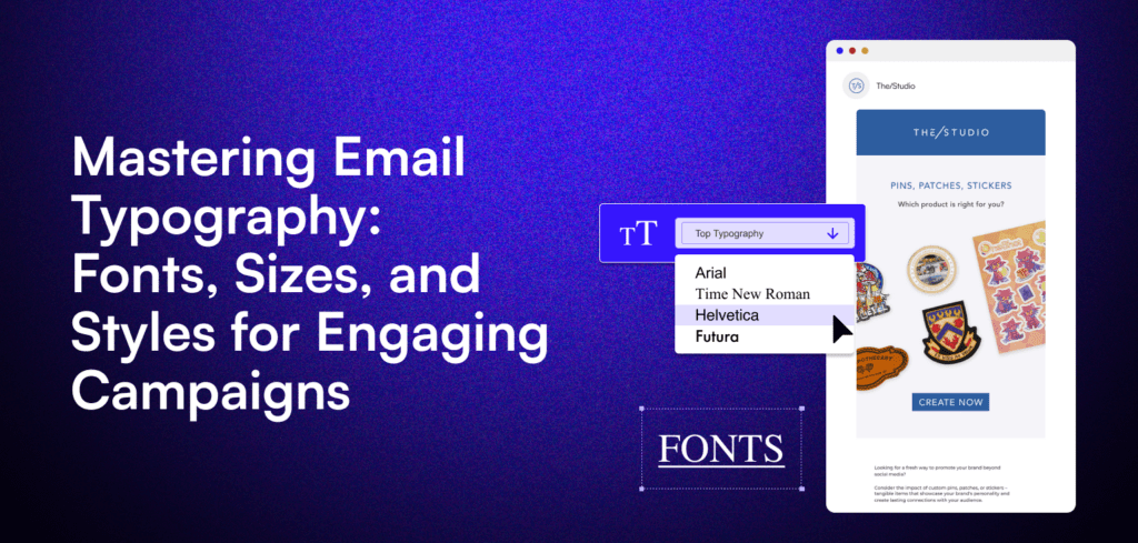
What is Typography in Email Marketing?
Every touchpoint with your customers is an opportunity to create a lasting impression. Your email marketing campaigns are no exception.
While compelling content is crucial, the visual appeal of your emails can make or break your subscribers’ engagement. That’s where email typography comes in – the art (and science) of arranging type to enhance readability, evoke emotions, and reinforce your brand identity.
Without further ado, let’s dive in!
Typography is the technique of arranging letters to make written language legible, readable, and visually appealing. In the context of email marketing, typography involves selecting the right fonts, sizes, colors, and styles to create an engaging and accessible email that aligns with your brand’s personality.
The way your email text looks can significantly impact how your audience perceives your message.
Good typography draws readers in, highlights key points, and encourages them to take action.
On the other hand, poor typography can make your email look unprofessional, difficult to read, or even spammy.
Choosing the Best Fonts for Your Email Campaigns
Fonts come in different families, each with its own characteristics and use cases. When it comes to email marketing, there are two main categories of fonts you should be familiar with: Web Safe Fonts and Custom Web Fonts.
What are Email Safe or Web Safe Fonts
These are fonts that are universally supported across different email clients and devices, ensuring that your email text looks consistent for all readers. Examples of web safe fonts include Arial, Times New Roman, and Helvetica.
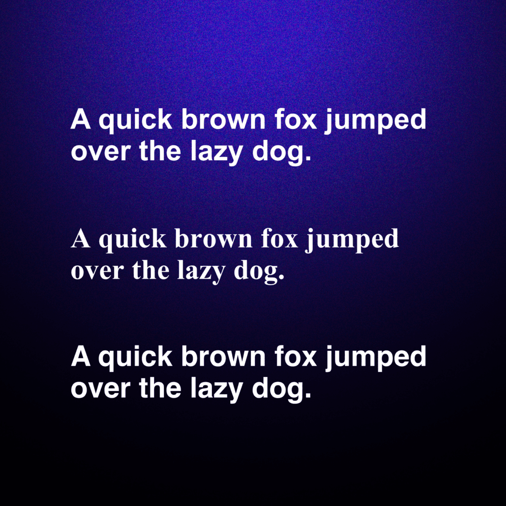
Web-safe fonts are a reliable choice because they will make sure that your email text appears consistent across different email clients and devices. They are universally supported, making them a safe bet for any email campaign. However, they may limit your creative options and make it harder to stand out in a crowded and noisy inbox.
What are Custom Web Fonts?
Custom fonts, or web fonts, are the ones that can be embedded into your email HTML, allowing you to use a wider variety of typographic styles. They can give your emails a more distinctive look and feel. They allow you to align your email typography with your brand’s visual identity, creating a more cohesive and memorable experience for your audience.
While web fonts can add personality to your emails, you need to make sure to set up fallback fonts in case they don’t render properly in certain email clients (such as Gmail, Yahoo Mail, or Apple Mail).
How to Enhance Email Readability and Accessibility
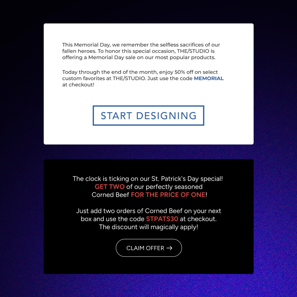
No doubt, choosing the right color is crucial for readability and accessibility. The main thing to remember is to keep the sufficient color contrast between the text and the background.
Here are some guidelines for selecting email text colors:
- Use high-contrast color combinations, such as black text on a white background or white text on a dark background, to ensure maximum readability.
- Avoid using light text on light backgrounds or dark text on dark backgrounds, as this can make your email difficult to read, especially for people with visual impairments.
- Consider your brand hues when choosing text colors—but always prioritize readability over aesthetic preferences.
Optimizing Font Size for Email Campaigns
Another critical factor in email typography is font size.
If your text is too small, readers may struggle to read your message. Remember, not everyone has a magnifying glass handy!
If the text is too large, your email will look unprofessional or overwhelming, like a punch to the face.
Here’s an industry rule of thumb: aim for a font size between 14px and 16px for body text, as this is typically easy to read across different devices. For headings, you can go larger to create a visual hierarchy and draw attention to key sections of your email.
When optimizing font sizes, make sure to use a responsive email template that adjusts font sizes based on the recipient’s device such as larger fonts for mobile devices, and test your email on different devices and email clients to check that the font sizes are legible and visually appealing.
Additional Font Formatting
In addition to font family, color, and size, other formatting options can enhance your email typography:
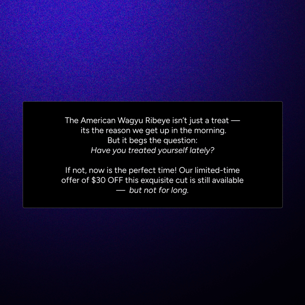
Italics
Use italics to emphasize specific words or phrases. However, use italics sparingly because they can make your text harder to read.
Underline
Reserve underlining for hyperlinks only. Using underlines for regular text can confuse readers and make your email look cluttered.
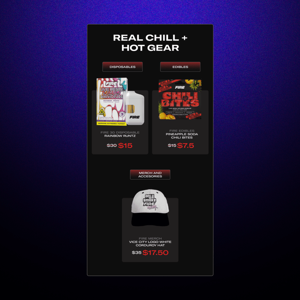
Strikethrough
Use strikethrough text to show changes or updates, such as a price change or a sold-out item. Use this formatting option sparingly to avoid visual clutter.
The Psychological Impact of Font Choices
Did you know that fonts have the power to evoke emotions and influence how your audience perceives your brand? Well, you do now.
Different font styles can convey different tones and personalities:
What are Serif fonts?
Serif fonts, like Times New Roman, Georgia, and Garamond, have small decorative lines or flourishes at the ends of the letterforms. These fonts are often associated with tradition, sophistication, and reliability. Think newspapers in the 1800s.
You can use serif fonts if your brand personality is classic, luxurious, or high-end because they can help convey these qualities.

What are Sans serif fonts?
Sans serif fonts, like Arial, Helvetica, and Open Sans, lack the decorative lines found in serif fonts. These tend to be more modern, clean, and approachable.
If your brand has a modern, minimalistic, or tech-savvy personality, sans serif fonts can reinforce these attributes.
What are Script Fonts?
Script fonts, such as Brush Script, Lucida Calligraphy, and Pacifico, mimic handwriting and often have a fluid, cursive appearance. These fonts can convey elegance, creativity, and femininity. You can use them if your brand has a luxury, artistic, or feminine personality.

To Recap
- Choose fonts that align with your brand personality and message tone.
- Prioritize readability and accessibility with high-contrast color combinations and legible font sizes.
- Use web safe fonts or include fallback fonts when using custom web fonts.
- Optimize your email typography for both desktop and mobile devices.
- Test your emails across different clients and devices, and continuously refine your approach based on performance data.

