You can’t grow your email list without asking, but how you ask makes all the difference.
These days, people are picky. They won’t just hand over their email address for nothing, especially not when your opt in form looks like it was slapped together during lunch break.
A generic pop-up, vague promise, or clunky form? That’s an easy “no thanks.” That’s where your opt-in strategy needs to step up.
It’s about creating a moment where your audience feels like hitting “subscribe” is the obvious choice. Give them something irresistible. Make it feel personal. Keep it simple, clean, and genuinely useful.
In this blog, we’re exploring powerful ways to use opt-in forms that don’t just sit there gathering dust; they convert. These tips will help you turn casual visitors into subscribers who actually want to hear from you.
Let’s get into it.
Why Opt In Forms Matter More Than You Think

You can drive all the traffic in the world, but if no one joins your list, you’re just shouting into the void. That’s where opt in forms come in.
These tiny boxes have one job: turn casual visitors into loyal subscribers. Done right, they build your email list with people who actually want to hear from you. That means better open rates, higher click-throughs, and less chance of landing in spam.
Opt-in forms also help you filter out low-intent users. Instead of blasting promos to random emails, you’re sending them to a list of people who raised their hand and said, “Yep, I want in.” That kind of permission-based marketing converts better.
In short, opt-ins help you grow smarter, not just bigger.
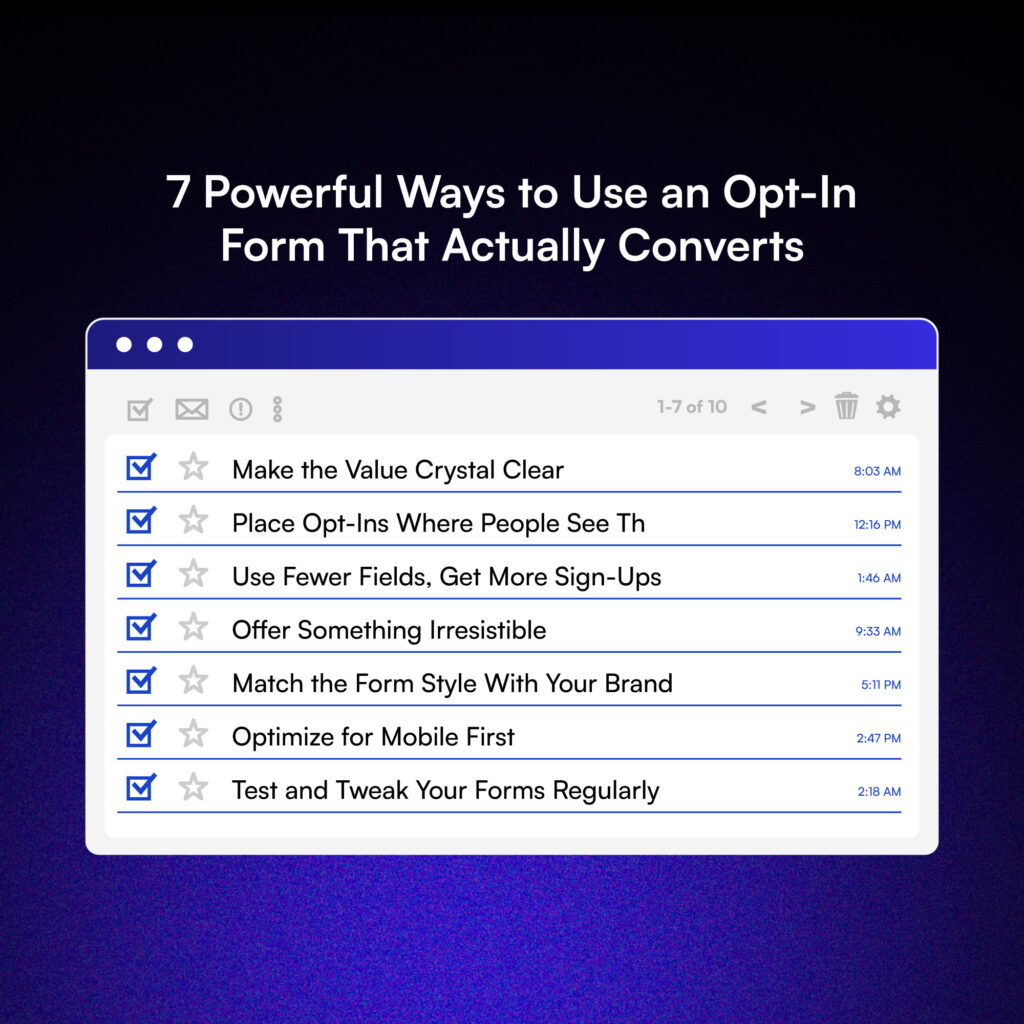
7 Powerful Ways to Use an Opt In Form That Actually Convert

Once your form is live, the real work begins. You need it to grab attention and give people a reason to sign up. These seven strategies will help you turn more visitors into subscribers without coming across as pushy or annoying.
1. Make the Value Crystal Clear
People don’t give out their email for nothing, you have to make it worth their while. Start with a headline that grabs attention, then follow it up with a subheadline that clearly explains the benefit. Lead with your strongest offer and make it obvious why signing up is a smart move.
Think less “Sign up for updates” and more “Get our free 12-step guide to doubling your traffic.”
Example:
“Join 5,000+ marketers and get weekly growth tips straight to your inbox.”
People want clarity and value up front. If your form doesn’t quickly show why it’s worth their time, they’ll scroll right past it.
2. Place Opt In Forms Where People See Them
Your opt in form could be gold, but if it’s hiding in the footer, no one’s going to find it.
Place your forms where users naturally engage: at the top of your homepage, inside high-performing blog posts, or in a well-timed exit-intent popup. Sidebar forms still work, but inline forms (like in the middle of a blog post) feel more personal and relevant.
Smart placements to try:
- Above the fold on landing pages
- After a helpful blog section
- As a scroll-triggered form when readers reach 50%
Right message, right time, right spot, that’s how you get the opt-in.
3. Use Fewer Fields, Get More Sign-Ups
The fewer hoops people have to jump through, the more likely they are to sign up. Long forms with multiple required fields can feel overwhelming, especially on mobile.
Think about it: Would you rather fill out five boxes or just one? Most of the time, all you need to get started is an email address.
Asking for a name, phone number and company info right away? That’s friction, and it turns people off. Start with the basics. You can always collect more details later once trust is built.
Quick comparison:
- Email-only forms tend to get the highest conversion rates.
- Email + first name can help with personalization down the line.
Anything beyond that? Only ask if it’s 100% necessary for your funnel or offer.
4. Offer Something Irresistible
If you want someone’s email, give them a reason they can’t ignore. This is where lead magnets shine; think free eBooks, discount codes, cheat sheets, checklists, templates, or access to an exclusive webinar.
The goal is simple: make them feel like they’re getting something, not just giving their email.
It’s all about the psychology of reciprocity. When people receive value first, they’re more likely to give something back.
Example offers that convert:
- “Download our free 30-day content calendar”
- “Get 10% off your first order”
- “Instant access to our full video library”
A compelling offer is the difference between someone scrolling past and someone joining your list.
5. Match the Form Style With Your Brand
A sleek opt-in form that fits your brand builds trust at first glance. A clunky or mismatched one? That’s an instant red flag.
Keep your form’s colors, fonts, and tone consistent with the rest of your site. If your brand is playful, your form copy can be cheeky. If your site is clean and corporate, keep the form professional and simple.
Visual consistency builds trust at a glance. When your opt in forms align with your brand’s look; same colors, fonts, and tone- it reassures users they’re in the right place. That seamless experience makes people feel more confident about hitting “submit.”
Tip: Don’t overload with flashy animations or ten different font sizes. Clean design wins.
6. Optimize for Mobile First
Most people are browsing on their phones. If your form doesn’t work well on mobile, you’re losing potential sign-ups fast. Users will bounce the moment something feels clunky or broken.
Common issues include:
- Tiny buttons that are hard to tap
- Fields that fall off-screen or overlap
- Pop-ups that are impossible to close
You don’t need a fancy design. You need one that works. Make sure your form loads quickly, adjusts to different screen sizes, and keeps the interaction smooth. Use larger buttons, legible text, and plenty of white space. Then test it on multiple devices: your own phone, a tablet, and even a friend’s.
A great mobile experience isn’t a bonus anymore. It’s the bare minimum if you want to convert your audience on the go.
7. Test and Tweak Your Forms Regularly
No opt in form stays perfect forever. What works like magic today might fall flat next week. That’s why testing is essential. A/B test different elements like headlines, button copy, placement, images, and even colors.
Even a small tweak to your CTA can make a huge difference in conversions. Instead of guessing what works, run tests and see what your audience actually responds to. Track key metrics like:
- Click-through rate (CTR),
- Conversion rate and
- Bounce rate or form abandonment
These numbers will tell you what’s resonating and what’s not. Your opt-in forms should be treated like living parts of your website, always learning, adapting, and improving.
With regular testing and tweaking, your forms will stay fresh, relevant, and effective at turning visitors into subscribers. The more you optimize, the more your list grows.
Final Thoughts
A solid opt in form works because it makes things easy and gives people a reason to care. It’s not about fancy graphics or clever lines; it’s about being clear, useful, and getting to the point. The easier you make it to say yes, the more people will.
But remember: Opt in forms are just one part of your email marketing puzzle. They work best when aligned with strong content, consistent messaging, and a clear user journey.
So don’t wait for the “perfect” setup. Start testing, learn what clicks with your audience, and keep refining. Your next subscriber might be one form away.


