Images and GIFs in Emails
Imagine your subscribers scrolling through their inboxes. They see your email, open it, and see stunning visuals that make them stop and take notice.
When you achieve that, they’re already one step closer to buying!
That’s the power of eye-catching images and GIFs in emails
Today, as our goldfish attention spans shrink continuously, email marketing visuals are your not-so-secret weapon to engage subscribers and increase your click-through rates.
But hold on a second – before you start cramming your emails with every meme and cat GIF you can find, let’s take a step back.
To truly maximize the impact of engaging email graphics, you need to understand the best practices for using them effectively.
It’s not just about making your emails look pretty; it’s about optimizing your visual email content for accessibility, performance, and conversions.
In this post, you’ll learn how to use email visuals to captivate your audience, elevate your email marketing efforts and drive impressive results.
Best Practices for Images in Emails
A picture is worth a thousand words, and when it comes to email marketing, the right image can be worth even more. But with so many options, it can be tough to know where to start.
Don’t worry – we’ve got your back. In the next parts, we’ll cover everything you need to know to create email images that not only look great, but also drive engagement and conversions.
Best Practice #1: Choose Suitable Images
Your subscribers value authenticity and they can spot a fake smile or a cheesy stock photo from a mile away.
Using genuine images in your emails helps build trust with your audience. It shows that you’re not just trying to sell them something, but that you truly care about connecting with them on a personal level.
Of course, we understand that not everyone has a professional photographer on staff or the budget for a custom photoshoot. In those cases, stock photos can be a lifesaver. But be careful – not all stock photos are created equal.
When choosing stock photos for your emails, prioritize images that appear authentic and relatable. Steer clear of overly staged or generic photos that obviously look like stock images. Instead, select photos that look candid and natural, as if captured in real-life situations.
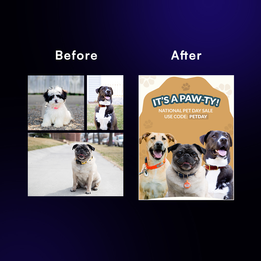
If you use stock photos, don’t be afraid to customize them to fit your brand. Add text overlays, filters, or graphics to make the image feel more unique and on-brand.
Best Practice #2: Choose the Right Format
What’s the right format for images in email, you might ask.
The two most common image formats for email are JPEG and PNG.
JPEG is like the little black dress of image formats – it’s versatile, compact, and works well for most situations. It’s great for photographs and images with lots of colors and gradients.
PNG, on the other hand, is like a tailored suit – it’s perfect for images with sharp lines, text, or transparency. It maintains image quality better than JPEG, but the file sizes tend to be larger.
So, how do you choose between these two formats? It’s simple:
- Use JPEG for photographs and images with lots of colors and gradients.
- Use PNG for images with sharp lines, text, or transparency.
By choosing the right format for your email images, you’ll ensure that they look sharp and load quickly, making your emails look more professional and engaging.
Best Practice #3: Mind the Size
When it comes to email images, size matters.
And no, we’re not talking about the size of your email list (although that’s important too). We’re talking about image size and format.
Choose the wrong dimensions or file type, and your email will be slower than the internet in the ’90s.
So, what’s the right image size for emails?
The sweet spot for email image width is around 600-800 pixels. This ensures that your images will look crisp and clear on most devices, from desktop computers to smartphones.

Best Practice #4: Add Alt Text
What is Alt Text or Alternative Text?
Alt Text is not just a fancy term for image captions; it’s a crucial accessibility feature that ensures your email images can be enjoyed by everyone, including those using screen readers.
Plus, if your images don’t load for some reason, alt text will save the day by describing what the image is supposed to be. So make sure that as you import your emails, write the appropriate Alt Text to all sections of your content.
Best Practices for GIFs in Emails
GIFs are like the secret sauce of email marketing – they add a dash of personality and a sprinkle of fun to your messages. But with great power comes great responsibility, and it’s important to use GIFs wisely.
Best Practice #5: Keep it Light
No one wants to wait around for a massive GIF to load, no matter how hilarious it is. It’s like waiting for a sloth to cross the street – painfully slow and frustrating.

To avoid this, aim for a GIF file size of 1MB or less. This will ensure that your GIFs load faster than a cheetah on a caffeine buzz, even on slower connections.
If you’re struggling to slim down your GIFs, consider using a tool like Giphy to compress them without sacrificing quality. It’s like putting your GIFs on a crash diet – they’ll still look great, but they’ll be much more streamlined.
Best Practice #6: Stay on Brand
GIFs are a great way to add some personality to your emails, but it’s important to use them strategically. A well-placed GIF can add humor and relatability to your message, but a random or off-brand GIF will make your email confusing.
When choosing GIFs for your emails, make sure they’re relevant to your content and audience. If you’re a serious business, a GIF of a dancing banana might not be the best choice (unless you’re selling dancing bananas, of course).
Use GIFs sparingly and strategically, and always keep your brand voice and tone in mind. You want your GIFs to enhance your message, not distract from it like a squirrel at a dog park.

Best Practice #7: Place Them Wisely
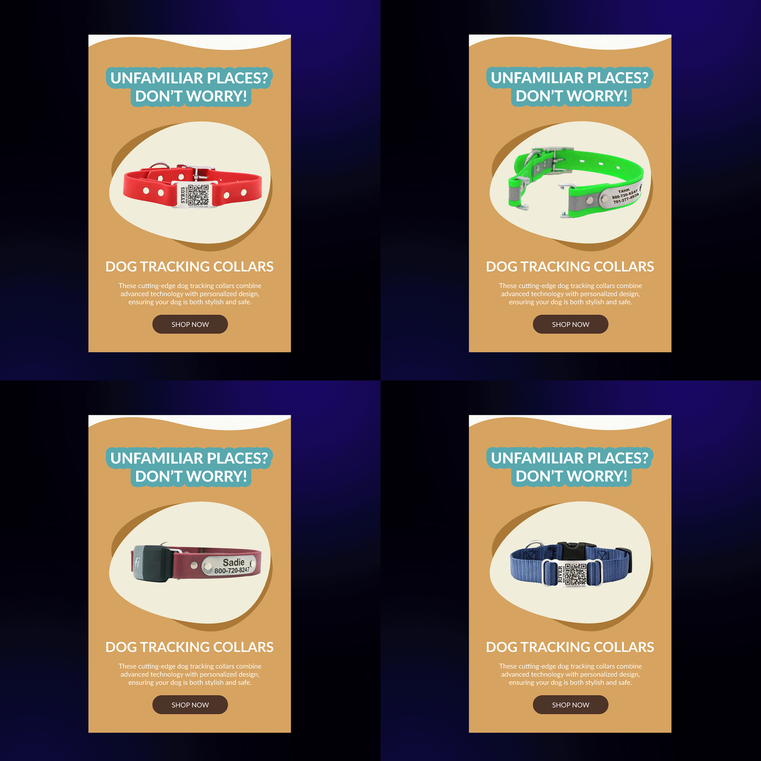
Just like with images, placement is key when it comes to GIFs in your emails. You want to use GIFs to guide your subscribers’ eyes through your message and highlight important information.
Place your GIFs near relevant text or calls-to-action, and use them to break up long blocks of text and add visual interest. But be careful not to overdo it – too many GIFs can be overwhelming and distracting.
And don’t forget about the email visual hierarchy. Just like with images, you want to use GIFs to support your message, not compete with it.
By following these best practices, you can use GIFs to add a touch of fun and personality to your emails, while still maintaining a professional and effective message. So go ahead – add a little GIF magic to your next campaign!
Bonus Best Practice: Test Before You Send!
You’ve chosen the perfect images and GIFs for emails, optimized them for size and format, and placed them strategically in your email. You’re ready to hit send and watch the conversions roll in, right?
Not so fast! Before you send your email to your entire list, it’s crucial to test it first. Testing your email ensures that your images look great and load quickly on all devices and email clients.
Here are 4 more tips to consider when testing your email:
- Tip #1: Check that your images load quickly and correctly on different devices and email clients.
- Tip #2: Make sure your images are aligned properly and don’t overlap with text or other elements.
- Tip #3: Test your alt text to ensure it displays correctly if images don’t load.
- Tip #4: Check for any broken links or images that don’t link to the correct destination.
By testing your email before you send it, you can catch any potential issues and fix them before they reach your subscribers’ inboxes. This helps ensure a smooth, professional experience for your audience and can even improve your email’s performance.
Wrapping Up
By following these best practices, you can use images and GIFs in emails to add a touch of fun and personality, while still maintaining a professional and effective message.
Remember, the key to email visual success is to always keep your audience in mind. Use visuals that are relevant, compelling, and on-brand, and don’t be afraid to get creative and try new things.
And most importantly, have fun with it! After all, if you’re not enjoying creating your emails, how can you expect your subscribers to enjoy reading them?
Read this next: The 4 Design Principles of an Effective Email

