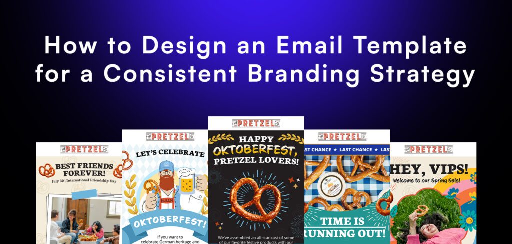
Picture this: your email lands in your subscriber’s inbox, and upon opening, they are greeted with an email that feels familiar.
That’s the power of a well-designed email template. It saves you time and establishes a strong brand identity that keeps you top of mind.
But how do you design an email template that captures your brand’s personality while effectively getting your message across?
Buckle up because in this blog, we will explore the best practices for designing email templates that engage, captivate, and convert.
Establishing a Consistent Brand Identity
Before we roll up our sleeves with the actual process of designing, let’s take a step back and focus on your brand identity. It’s like your brand’s personality—the way it looks, feels, and speaks to your audience.
That said, your copy should read consistently not only on your emails, but your website, social media posts, and other communication channels. This will help your audience recognize a familiar voice in their head, and familiarity helps with conversion!
When it comes to designing an email template, make sure it’s in line with your brand guidelines.
Consistency is the name of the game here.
By maintaining a cohesive look and feel across all your marketing channels, especially email, you’ll reinforce your brand recognition and build trust with your audience.
Laying Out Your Email
Now, let’s talk about the backbone of your email marketing template—the layout.
Think of it as a map that guides your reader’s eye through your content. It highlights the important bits and the calls to action that will get the clicks.
Keep it simple with a single-column layout. Use clear sections and headings to break up your content into easily digestible chunks.
And don’t forget the power of whitespace! Give your content some breathing room, and your readers will thank you for it.
A cluttered email template is like a crowded room—it’s overwhelming and makes it hard to focus on what actually matters.
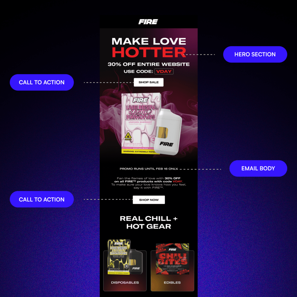
Creating a Captivating Hero Section
Your email header is like the front door to your message. It’s the first thing your subscribers see, so make it count!
Showcase your logo loud and proud to reinforce brand recognition.
Consider adding a snappy tagline or a brief message that captures your brand’s personality or the purpose of your email. Keep it short, sweet, and memorable.
Use your brand colors in the header to create a seamless, cohesive look. Just make sure they play nicely together and provide enough contrast for easy reading.
Keep in mind that some recipients do not scroll beyond the header section— so, make sure that all the important information is written and shown on the hero. These include sale details, urgency lines, promo codes, and most importantly, a clear call to action.
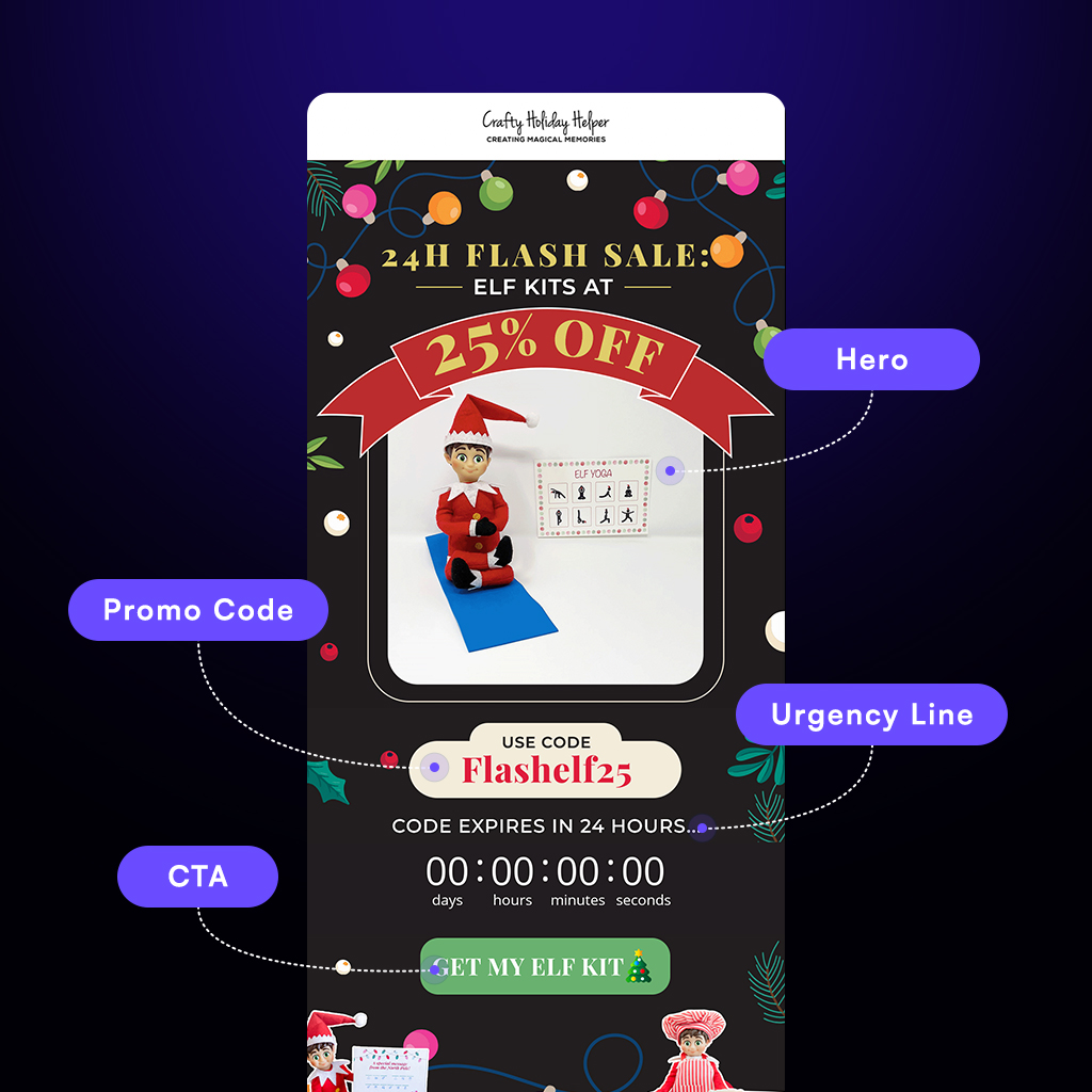
Writing the Email Content
Now, let’s dive into the meaty part of your email template—the content sections. This is where your message really shines, so make it engaging and irresistible.
First, make sure to use concise headings to introduce each section and guide your reader through the information. Use images, GIFs, or illustrations to break up text and give your readers some processing time.
Use icons to convey your message better and do not forget to use your brand’s fonts consistently throughout your email and your coming emails.
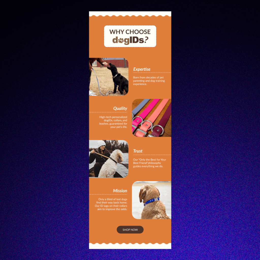
Designing an Email Template for All Platforms
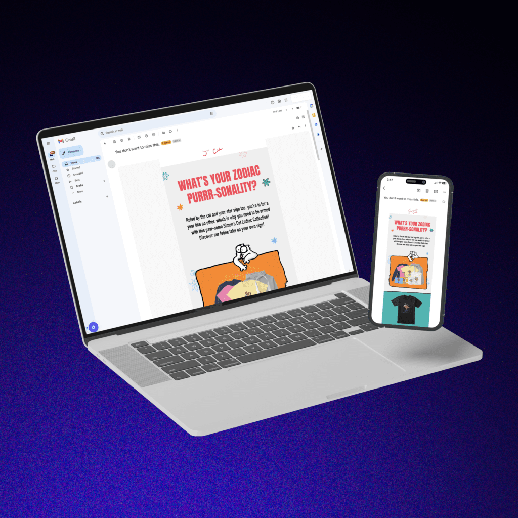
In today’s mobile-first world, email template design best practices dictate that your template must be responsive and look awesome on any device, whether it’s a desktop, tablet, or smartphone.
Use a responsive email template that adapts to different screen sizes, so your content is always easily readable and clickable, no matter where your subscribers are opening it.
And don’t forget to test, test, test!
Send your email template to various email clients (such as Yahoo Mail, Gmail, Outlook) and devices to make sure it looks stunning and functions flawlessly.
This way, you’ll also see if all the elements on your email work on all devices.
Ready to Get Creative?
Designing an email template that engages your audience is only the first step in converting them.
But by nailing down your brand identity, choosing the right layout, crafting compelling header and content sections, and optimizing for all devices, you’ll create emails that stand out and get results.
Now, you have the knowledge to create an email that packs a punch. Happy designing!
Read this next: How Many Marketing Emails Should You Send Per Week? Plus 4 Steps to A/B Test For The Ideal Frequency

