Imagine crafting the perfect email that lands in thousands of inboxes. The subject line? Irresistible. The content? Engaging and valuable. But when you check your analytics, the conversion rate is underwhelming. The culprit? It might just be your email call to action (CTA).
Your email call to action is the bridge between your content and the action you want your readers to take. Get it right, and you’ll see your engagement soar. Get it wrong, and even the most compelling email can fall flat.
In this guide, we’re diving deep into the art and science of crafting CTAs that don’t just get clicked – they drive real results.
What is an email call to action?
An email call to action (CTA) is a prompt that encourages your subscribers to take a specific action, whether that’s making a purchase, signing up for a webinar, or reading a blog post.
Does every email need a call to action?
Short answer: Yes.
Every email should have a purpose, and your email call to action is what helps fulfill that purpose. Without a clear CTA, your subscribers might read your email and think, “That’s nice,” before moving on to the next message in their inbox.
How many calls to action can an email have?
When it comes to CTAs, less is often more. Marketing experts are divided on the exact number, but the consensus is to keep it minimal. Here’s why:
Avoid Unnecessary Cognitive Load
Cognitive load refers to the mental effort required to process information. In our fast-paced, distraction-filled world, excessive cognitive load can prevent readers from engaging with your emails at all.
Too many CTAs create decision fatigue, potentially leading to no action at all. While some experts advocate for a single CTA per email, others suggest it depends on your goals and email design. The key is to make your primary email call to action clear and prominent.
Maintain Focus on Your Primary Goal
Each email should have a primary objective. Multiple CTAs can dilute your message and confuse your readers about what you want them to do most. By limiting your CTAs, you ensure that your audience understands your main goal and are more likely to take the desired action. This focused approach can significantly improve your conversion rates.
Improve Email Design and User Experience
Too many CTAs can clutter your email design, making it look busy and unprofessional. A clean, streamlined design with one or two well-placed CTAs is more visually appealing and easier to navigate. This improved user experience can lead to higher engagement rates and a better overall impression of your brand.
Where should you put your Email CTA button?
Strategic placement is crucial for effectiveness. A good rule of thumb is to place your email call to action at the bottom of each relevant section, providing context and making it easy for readers to take action at the moment of peak interest.
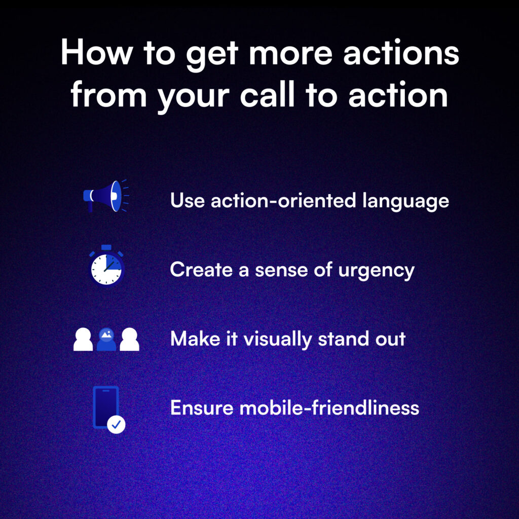
How to get more actions from your call to action
Here are a few tips to maximize your CTA’s potential.
Use action-oriented language
Employ strong, persuasive verbs that clearly communicate the desired action. Replace vague phrases like “Click here” with specific, compelling language such as “Claim your free trial” or “Start saving today”.
Create a sense of urgency
Incorporate time-sensitive language or limited-time offers to motivate immediate action. Use phrases like “Limited time offer” or “Ends midnight tonight” to create FOMO, but use this tactic sparingly to maintain credibility.
Make it visually stand out
Use contrasting colors, larger font sizes, or buttons to make your CTA pop. Leverage design principles like white space to naturally draw the eye to your CTA. A/B test different designs for optimal results.
Ensure mobile-friendliness
With about 60% of emails opened on mobile, make CTAs easily clickable on smaller screens. Use larger buttons with ample padding and test across various devices for optimal performance.
5 Examples of Highly Effective Email Calls to Action
These are CTAs that we at 11 Agency know that work!
Shop Now
This classic CTA is direct and leaves no doubt about the desired action. It’s particularly effective when accompanied by a strong hero section or compelling supporting statements. For example, pairing “SHOP NOW” with high-quality product images and a brief, enticing description can create a powerful urge to explore your offerings.
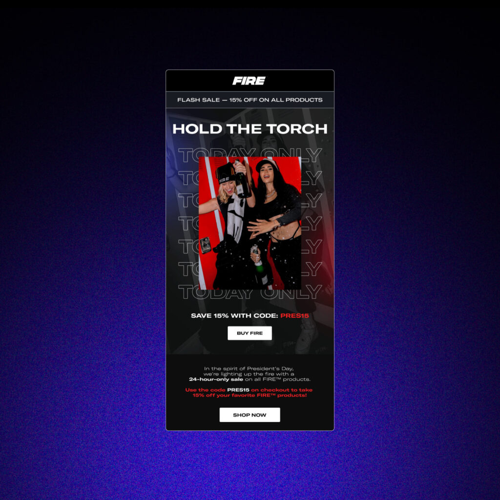
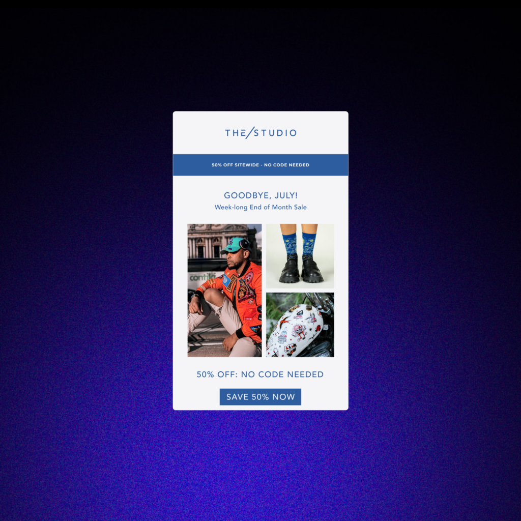
Save 50% Now
This email call to action combines urgency with a clear value proposition, making it hard to resist. The specific percentage (50% in this case) provides concrete savings, which is more compelling than a vague “Save Now.” It’s especially effective for flash sales, clearance events, or when introducing a new product with an introductory discount.
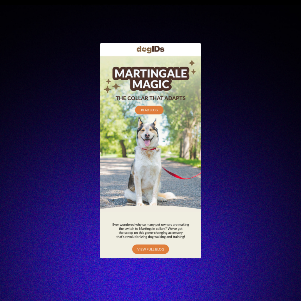
Read Full Blog
Perfect for nurturing leads and building authority, this email call to action works best when paired with an intriguing preview that leaves readers wanting more. Use it to drive traffic to your blog, increase time on site, and guide potential customers through your sales funnel.
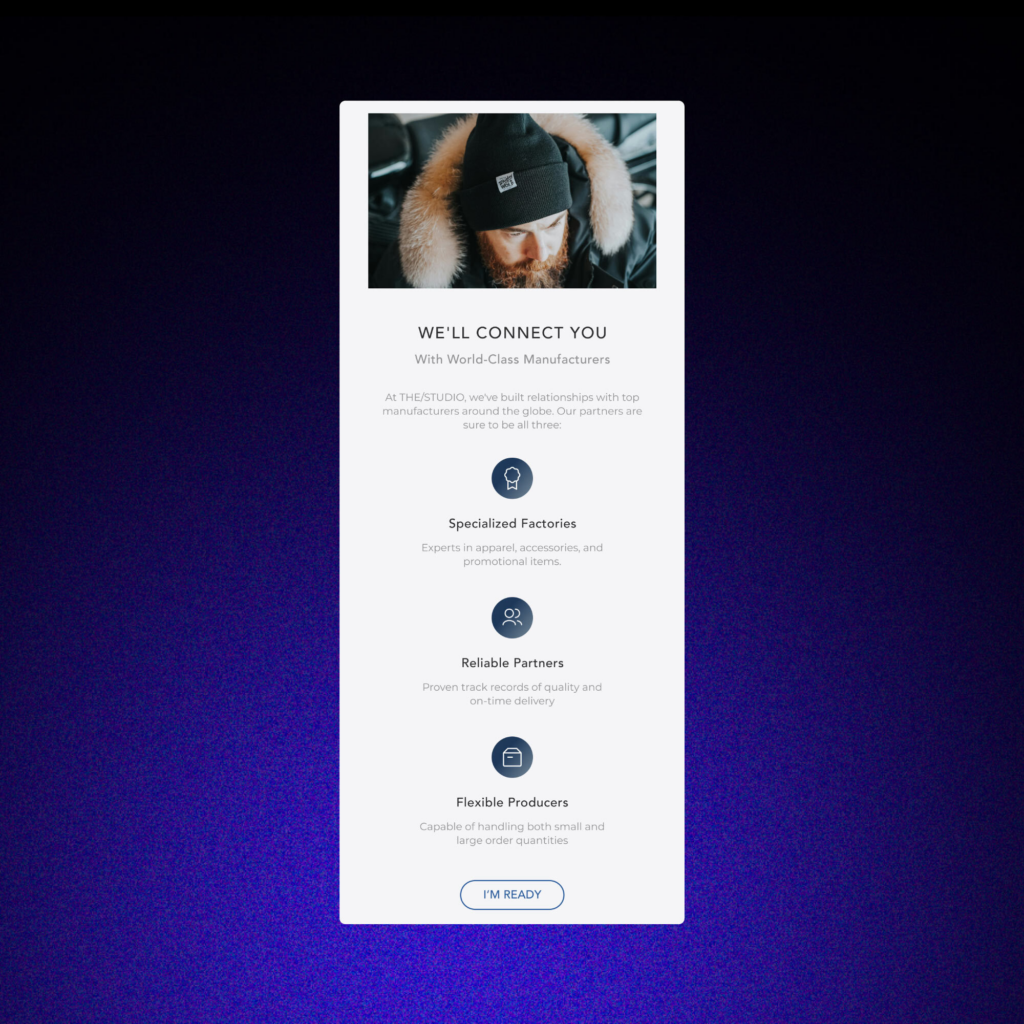
I'm Ready
This CTA taps into the subscriber’s mindset and makes the decision feel personal. It’s particularly effective for commitment-based actions like starting a free trial, joining a program, or scheduling a demo. The first-person perspective creates a sense of agency, encouraging the reader to take ownership of their decision.
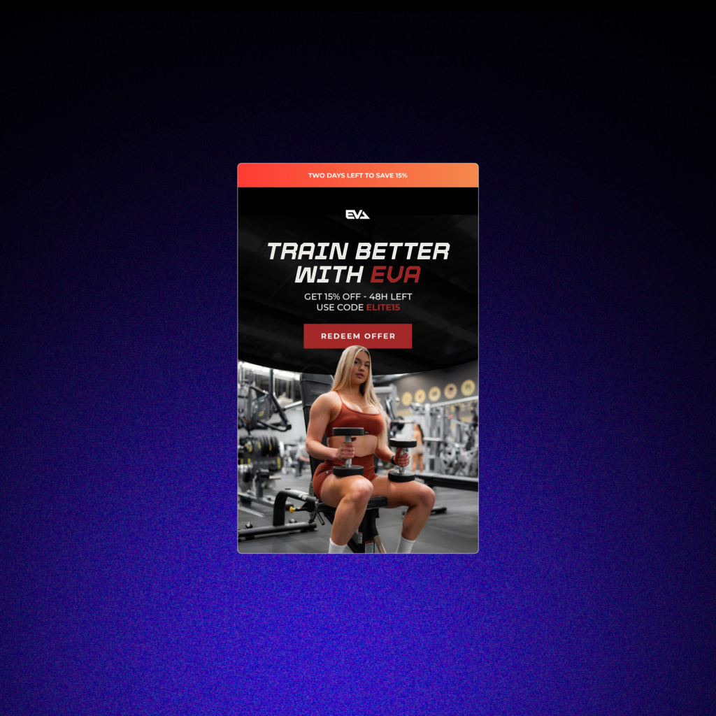
Redeem Offer
This email call to action implies exclusivity and prompts immediate action, making the reader feel like they’re getting something special. It’s effective for limited-time promotions, loyalty rewards, or personalized offers. The word “redeem” suggests that the offer already belongs to the reader; they just need to take action to receive it.
So, what now?
Remember, the best email call to action is one that aligns with your email’s purpose and resonates with your subscribers. So go ahead, put these tips into practice, and watch your email performance soar!
Read this next: What is Click-to-Open Rate or CTOR in Emails? Plus 10 Tips for Improvement
Ready to revolutionize your email marketing? Start by revamping your CTAs today!

