You made it.
You’ve written a striking subject line and a great supporting preview text.
Your email got clicked open.
. . .what now?
It’s the email design’s time to shine.
You may be asking yourself: How do I know when your email is well-designed?
It’s simple, really.
An email is well-designed if it can engage, persuade, AND inspire action.
Next question, how can you apply the design principles of an effective email to achieve all three?
The answer lies in understanding and applying the core principles of effective email design.
In this blog, we’ll explore these principles to help you create emails that engage, persuade, and inspire action.
Design Principles of an Effective Email: A Comprehensive Guide
Without further ado, let’s explore the key design principles that can transform your emails from ordinary to extraordinary, helping you create compelling messages that resonate with your audience.
Guiding the Reader with Hierarchy
Wait, what is hierarchy?
Hierarchy in email design is the order in which elements are organized to convey importance. This is done through positioning, scale or sizing, and color.
In other words, it is the order you want your recipients to follow when reading your email.
To create a clear hierarchy, you should identify the primary goal of your email. You can be promoting a product, sharing content, or encouraging action. Structure your email design to highlight key information and strong calls-to-action, or CTAs.
You can use headlines, bold text, and strategic placement to emphasize crucial elements. Lead your reader through the email and create a logical flow from one point to the next.

Creating Contrast for Impact
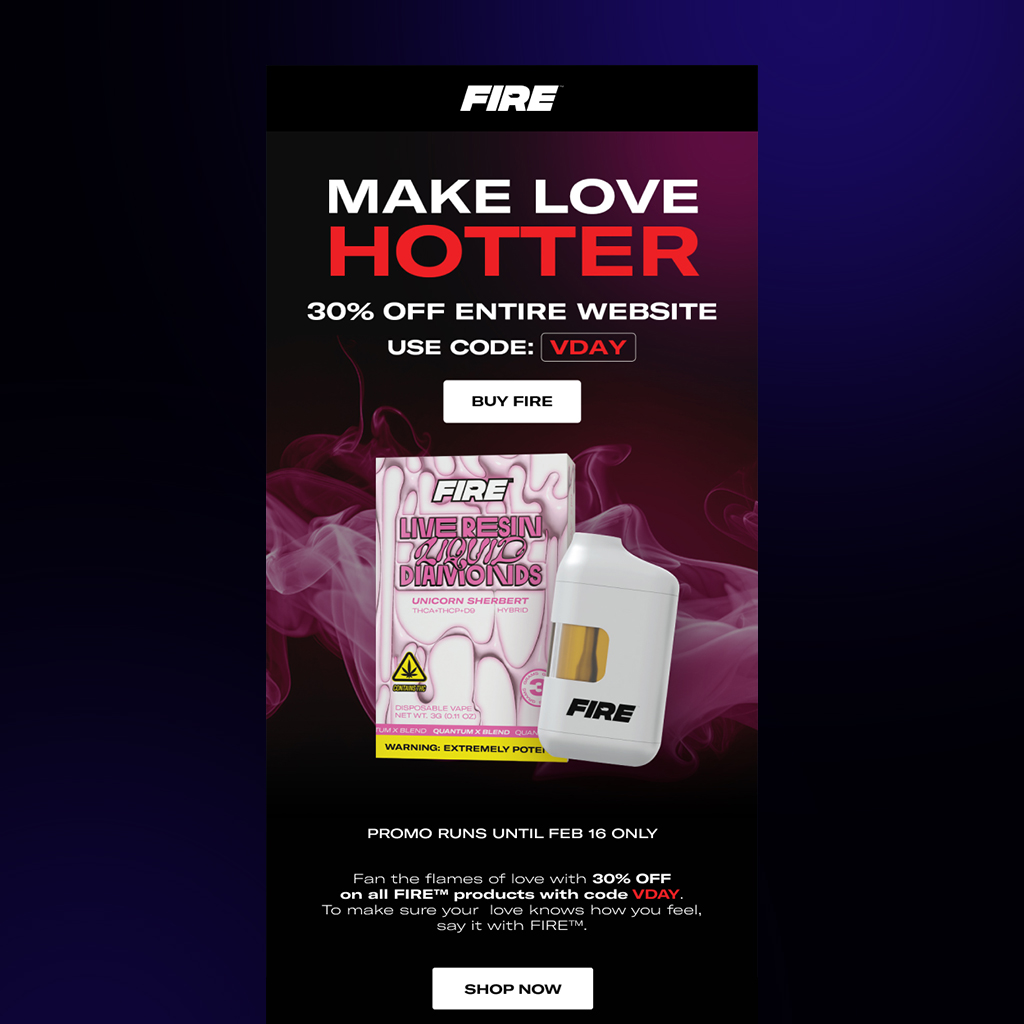
When it comes to email design, best practices dictate that your content stand out from the background. Contrast is essential as it grabs attention and leaves a lasting impact.
To achieve effective contrast, experiment with colors, fonts, and sizes. Use eye-catching colors for your call-to-action buttons to make them unmissable. You can also try pairing font styles that contrast to create visual interest and hierarchy.
Use contrast strategically to enhance your message without overwhelming it. Striking a balance between making key elements stand out and maintaining a visually appealing design takes practice and talent, but don’t be afraid to be creative and play around!
In simple words: make it pop!
Choosing the Right Colors
What are your primary brand colors?
It’s no secret that colors play a crucial role in evoking emotions and setting the tone for your brand.
When designing effective marketing emails, your colors should consistently reinforce your brand identity and create a recognizable presence in your subscribers’ inboxes.
While it’s important to have a distinct color palette, having too many brand colors can be overwhelming and may dilute your impact. Typically, it’s recommended to have 2-3 primary brand colors and 1-2 secondary or accent colors.
Having 5 brand colors is possible, but it may be challenging to incorporate them all consistently and effectively across your emails.
When selecting your brand colors, consider color psychology and how different hues influence your audience’s emotions and actions.
Here are some examples of color combinations that work well together and align with different brand identities:
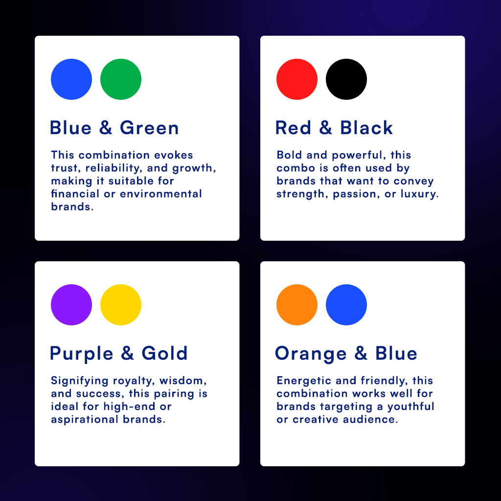
Then, when designing emails, use colors strategically to create urgency, evoke trust, or convey specific emotions.
Don’t forget optimal readability too! Make sure there is sufficient contrast between the color of your text and the background, so your message would not get lost in the design.
Balancing Design Elements
Every element of your email design should serve a purpose.
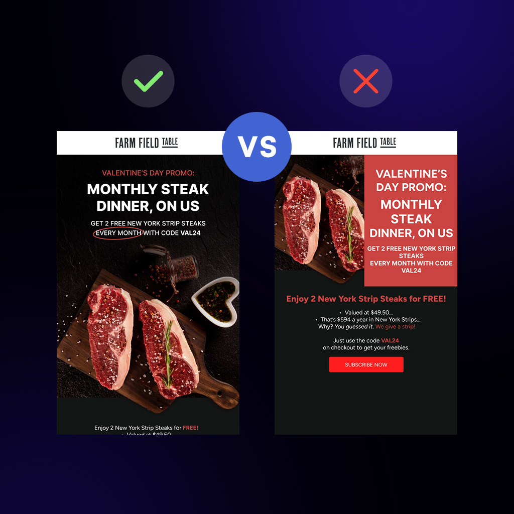
A well-designed email marketing template relies on the balance of its elements. Text, images, whitespace, and calls-to-action must work together in synergy to create an engaging experience for your audience.
The visual weight of each element matters.
When there are too many elements squeezed into the hero section, the email will look cluttered and clunky. When the body copy gets too long, you risk the email looking uninteresting.
So, if your hero section contains product photos or lifestyle images, it’s best to follow that through with a breathable body section.
Ready to Get Creative?
Designing effective email campaigns is a blend of hierarchy, contrast, balance, and color. By understanding and applying these principles, you’ll create emails that captivate your recipients and drive results.
When crafting your next email blast, keep these principles in mind.
By mastering the principles of effective email design, you can stand out in crowded inboxes and create a stronger connection with your subscribers.
Read this next: How to Design an Email Template for a Consistent Branding Strategy

