Do you feel like your subscribers just aren’t engaging with your emails
You’ll know it when you have great Open Rate, but low Click Through Rates.
Well, good news! The key to boosting your email readability and user experience (UX) will be discussed in these 11 essential layout tips for highly readable emails.
And so without further ado, let’s get to it.
11 Layout Tips for Highly Readable Emails
Tip #1: Make a Responsive Email Design
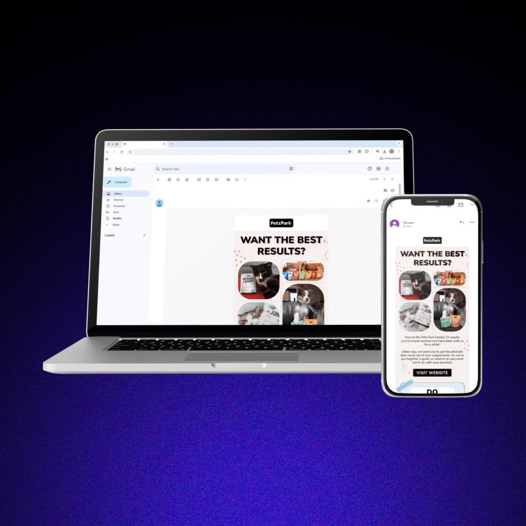
These days, people access their emails from a variety of devices, like desktop computers, smartphones, and tablets. If your emails aren’t optimized for different screen sizes, your subscribers may have a frustrating experience trying to read and engage with your content.
This can lead to decreased user engagement, higher unsubscribe rates, and ultimately, negatively impact your brand reputation.
How can I make my emails responsive, you may ask?
Use fluid layouts so they automatically adjust their alignment and proportions for different page orientations and sizes. It would also help to optimize your images to load quickly on any connection.
Tip #2: Make Your Content Scannable
Let’s state the obvious— people hate reading.
It’s safe to assume that your subscribers don’t have the time to read through long walls of text. If your emails are difficult to scan and navigate, your subscribers are likely to lose interest and move on to something else.
To keep your readers engaged, prioritize scannable content.
But how can I make my email scannable? You’re probably wondering.
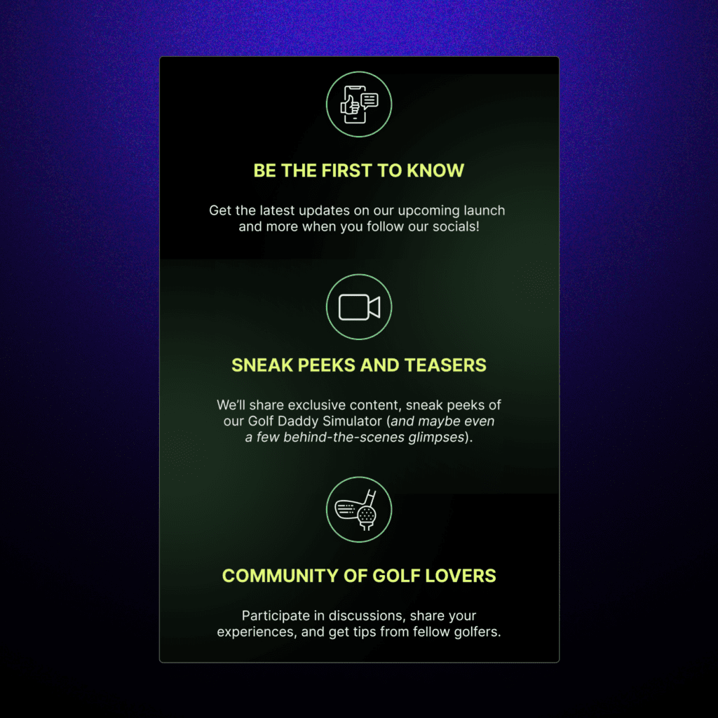
You can break up your text into short, easily digestible chunks using subheadings, bullet points, and short paragraphs. By doing so, your content will be easy to scan and understand at a glance, and you’ll keep your subscribers interested and more likely to take action.
Tip #3: Leverage White Space
Many designers focus on the content and forget about the importance of what’s not there— white space, also known as negative space. These are the empty areas around and between elements in your email.
It might seem counterintuitive, but incorporating plenty of white space can actually make your emails look more professional and make them more effective.
Wait, how does white space affect email readability?
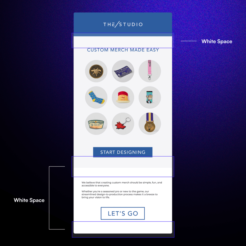
By giving your content room to breathe, white space creates a sense of balance and makes your email feel less cluttered and overwhelming. It helps guide your readers’ attention to the most important elements and makes it easier for them to focus on your message.
To achieve this, use adequate padding, margins, and line spacing to break up your content and create a clean, visually appealing layout that’s easy on the eyes.
Tip #4: Choose Legible Fonts
Your choice of fonts can have a big impact on the readability and overall effectiveness of your emails. An easy-to-read font can enhance your message and make your emails more engaging.
So, what are the best fonts for email readability?
Stick to simple sans-serif ones (or the ones with no hats and tails), especially for the body text. Avoid using fancy or decorative fonts that may be difficult to read.
Sure, you can be creative, but it’s also a good idea to limit the number of different fonts you use in your email to create a cohesive and professional look.
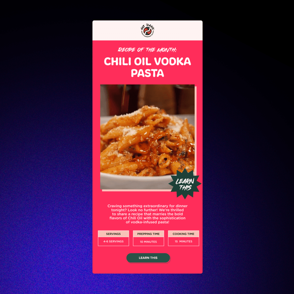
Tip #5: Strategically Place Your Call-to-Action (CTA)
Your call-to-action (CTA) button is one of, if not the most important elements of your email. It’s the button or link that encourages your subscribers to take a specific action, whether it’s making a purchase, signing up for a newsletter, or downloading a resource.
If your CTA is hard to find or unclear, your subscribers may not take the desired action, and your email campaign will be less effective.
Where should you place your CTA in an email?
The best place for your CTA is above the fold, which means it should be visible without the need to scroll.
Use a clear, eye-catching button with concise, action-oriented text that tells your subscribers exactly what you want them to do. Experiment with different colors, sizes, and placements to find what works best for your audience.

Tip #6: Implement a Clear Visual Hierarchy
A clear visual hierarchy in email is the arrangement and organization of elements in your email, such as headings, subheadings, images, and buttons, in a way that guides your readers’ attention and helps them quickly grasp the main points of your message.
How do I create a visual hierarchy in my email layout?
Start by using different font sizes and colors to distinguish between headings and body text. Use larger, bolder fonts for your main headings and smaller, more subtle fonts for subheadings and body text.
Use positioning and spacing to group related elements together and create a logical flow from top to bottom.
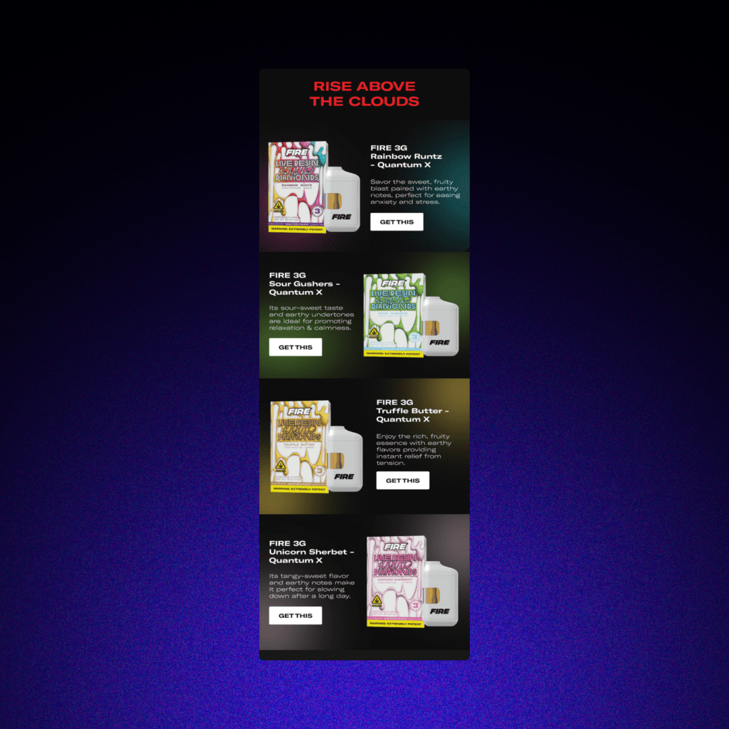
Tip #7: Compress and Optimize Images
Humans are visual beings, so images are a powerful tool for enhancing the appeal and effectiveness of your emails.
They can help break up text, illustrate key points, and add personality to your message. However, if your images are too large, slow to load, or not optimized for email, they can hurt your email’s performance.
Start by compressing your images to reduce their file size without sacrificing too much quality. This will help your emails load faster, especially on slower connections.
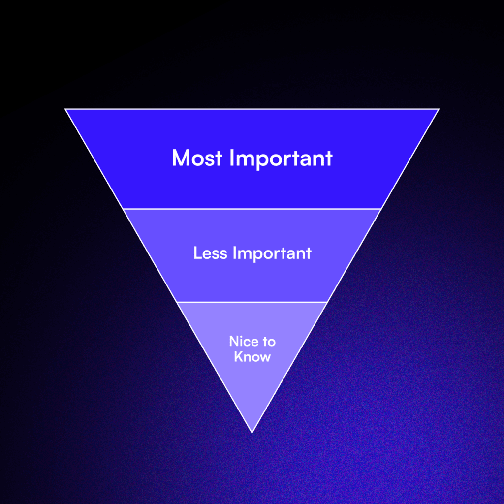
Tip #8: Use the Inverted Pyramid Style
What is the inverted pyramid style, and how does it improve email readability?
The inverted pyramid style is a technique that’s particularly effective for email marketing. It involves structuring your content with the most important information at the top, followed by supporting details and background information further down. This approach is designed to grab your readers’ attention quickly and keep them engaged throughout the email.
By putting your key message or offer right at the beginning of your email, you’ll capture your subscribers’ interest and encourage them to keep reading and improve information retention.
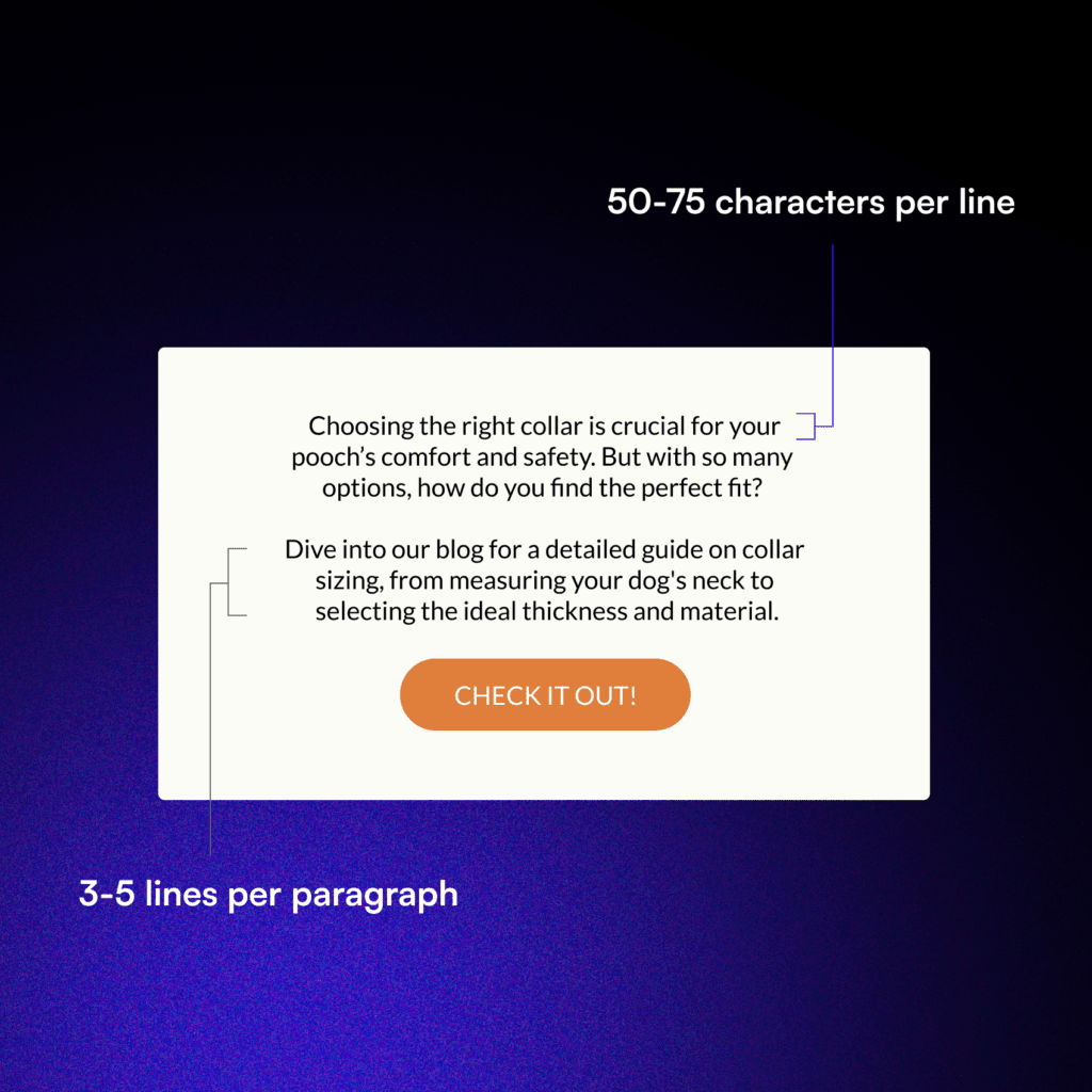
Tip #9: Limit Your Line Length
The length of your email’s lines can have a big impact on readability and user experience. If your lines are too long, your subscribers may have trouble tracking from one line to the next, leading to eye strain and difficulty comprehending your message.
On the other hand, if your lines are too short, your email may look choppy and disconnected, making it harder to follow your train of thought.
What is the optimal line length for email readability?
As a general rule, aim for a line length of 50-75 characters per line. This range has been shown to provide a comfortable reading experience that’s easy on the eyes and helps maintain focus.
Tip #10: Ensure Accessibility for All Readers
Accessible emails ensure that everyone can read and engage with your content, regardless of their abilities or the tools they use to access their emails.
Now, how can you make your emails more accessible?
Start by using descriptive alt text for all your images, which helps subscribers using screen readers to understand the content and context of your visuals.
You should also make sure that there’s sufficient color contrast between your text and background colors, making it easier for subscribers with visual impairments to read your emails.
Tip #11: Test and Refine Your Email Layout
Just like anything in marketing, creating effective email layouts is an ongoing process that requires regular testing and refinement. Even the most well-designed emails can benefit from continuous improvement based on subscriber feedback and performance data.
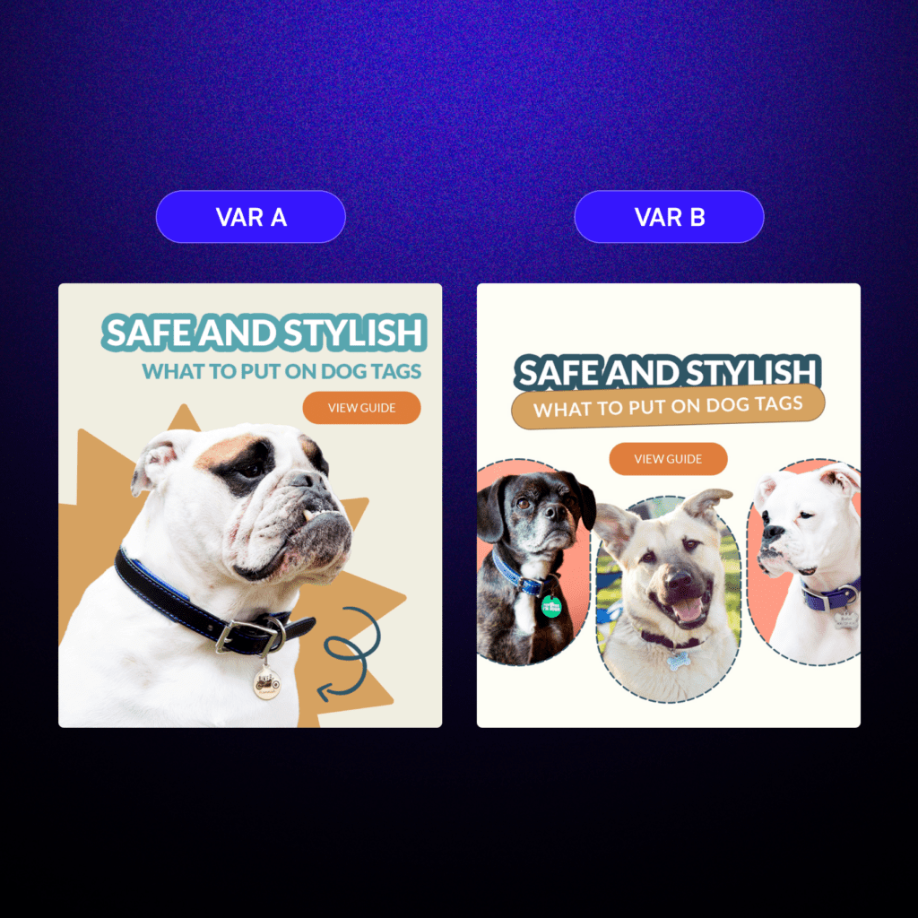
You can start by conducting regular A/B testing, which involves sending two versions of your email with different design elements to a portion of your list and comparing their performance.
Analyze your email analytics to identify areas where your emails are underperforming and make data-driven decisions about how to optimize them.
By regularly testing and optimizing your email layouts, you can ensure that your emails are always performing at their best and providing the most value to your subscribers.
The Bottom Line
Remember, the key to successful email campaigns is putting your subscribers first and focusing on delivering value and a great user experience.
So what are you waiting for? Start putting these tips into practice today and watch your email engagement and conversions soar!
Read this next: The 4 Design Principles of an Effective Email

